

Education International
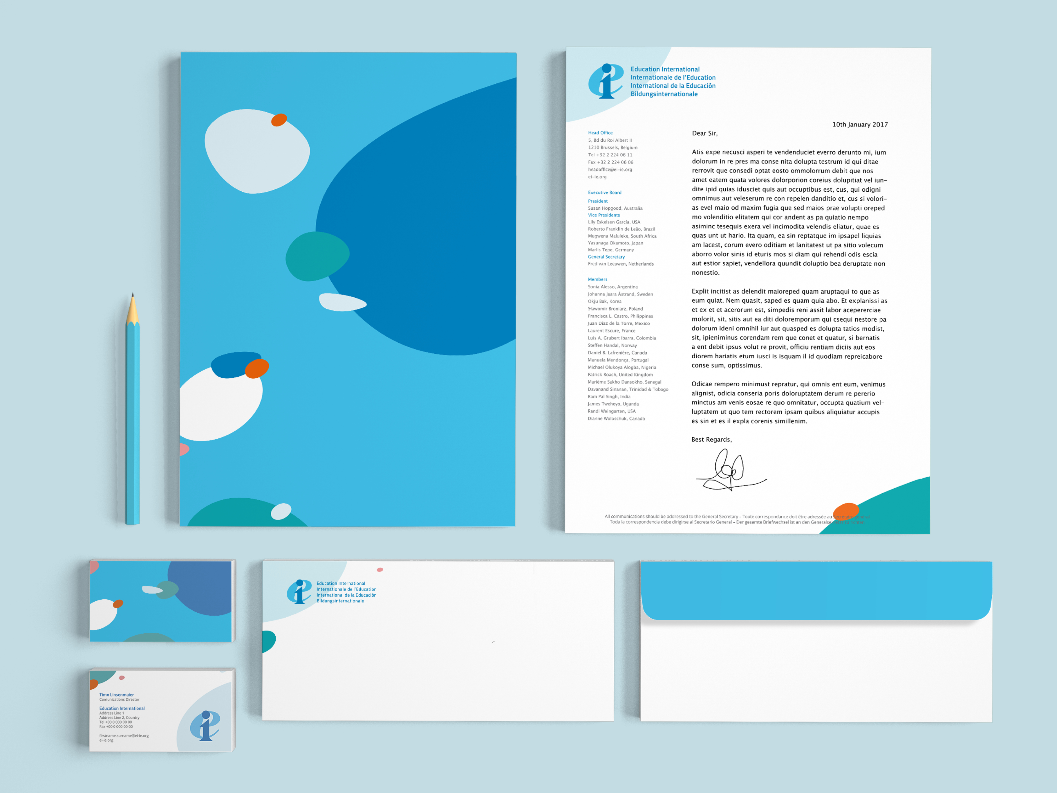
Education International is a worldwide trade union network for teachers. It is a sprawling organisation, putting out events and publications managed at the local level. The global brand desperately needed alignment, but the client wanted to avoid a change of logo, so I designed a refreshed brand system incorporating the existing logo.

Strategy
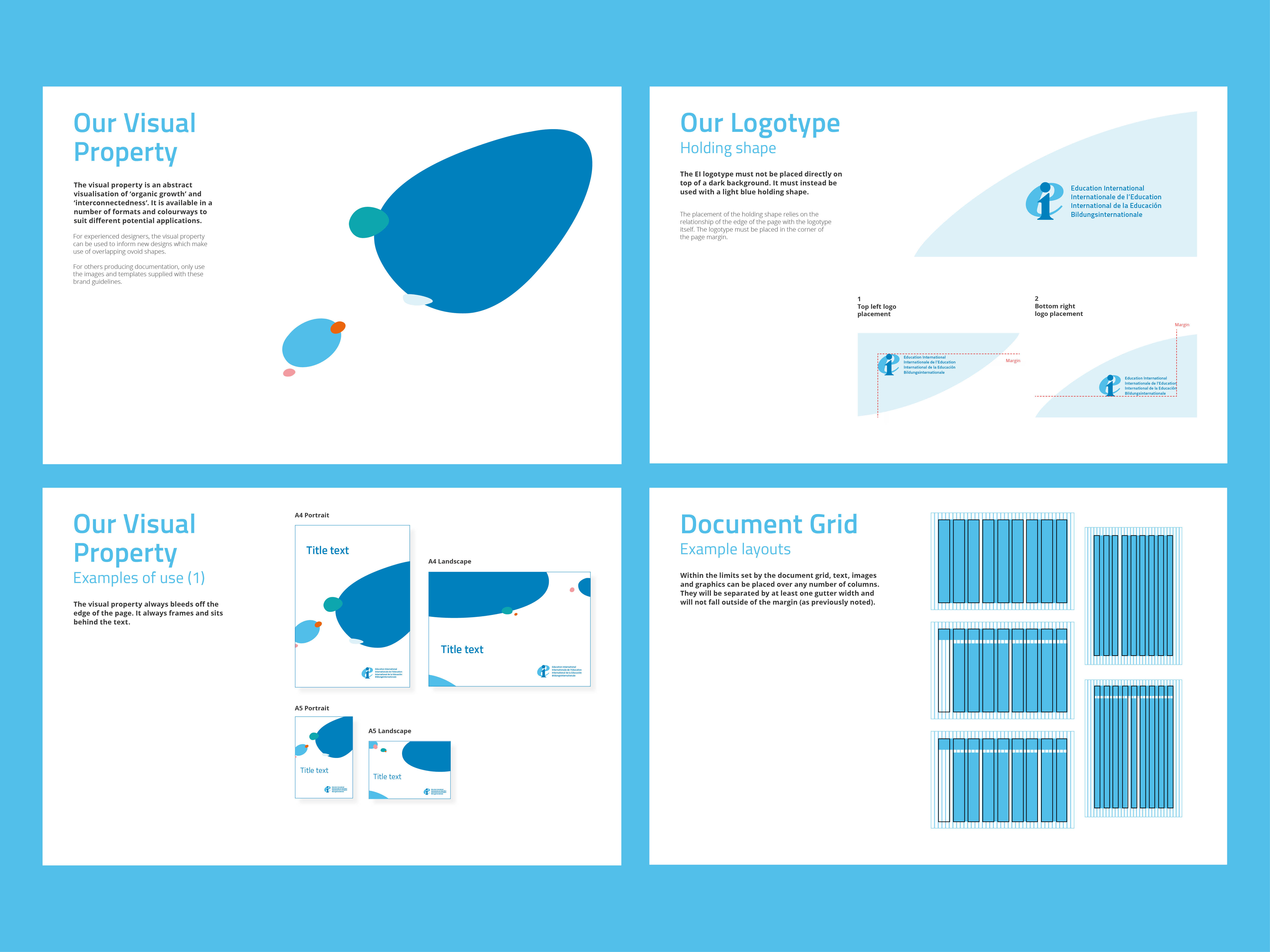
The client asked for a bold, decisive look. We proposed several routes, tying the client’s request to the idea of education as a personal and nurturing activity. The client chose the route I had developed, based on the elliptical elements of the logo and inspired by artists Joan Miro and Alexander Calder.
Execution and Delivery
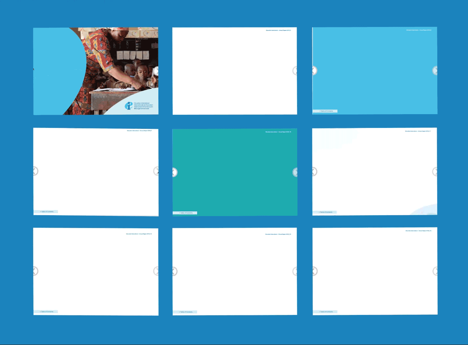
I produced brand elements and guidelines for a variety of layouts and uses and compiled into a brand library and style guide. I then produced their annual report, as a digital publication, based on the new brand.