Stones Tour ’24
branding
typographic design
guidelines
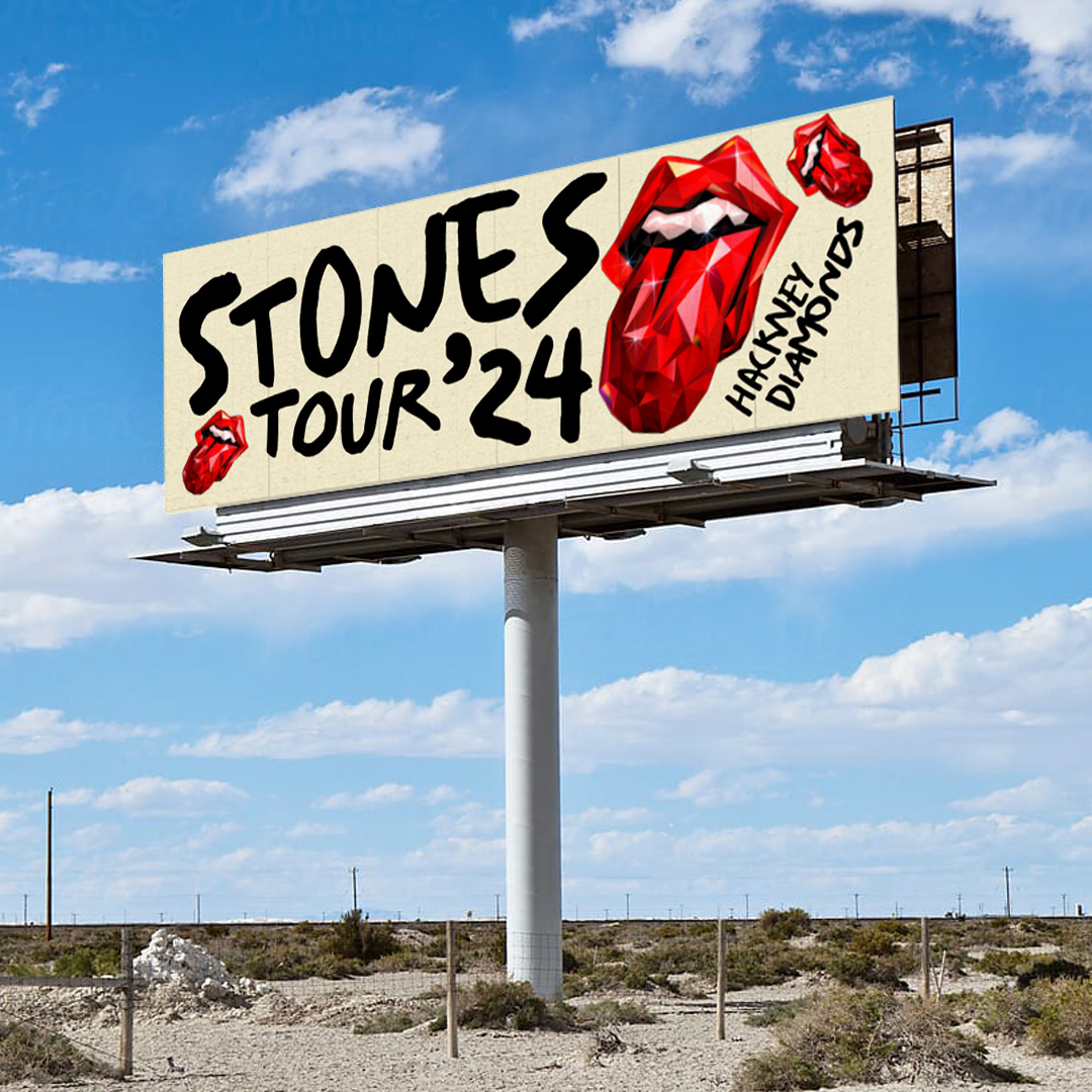
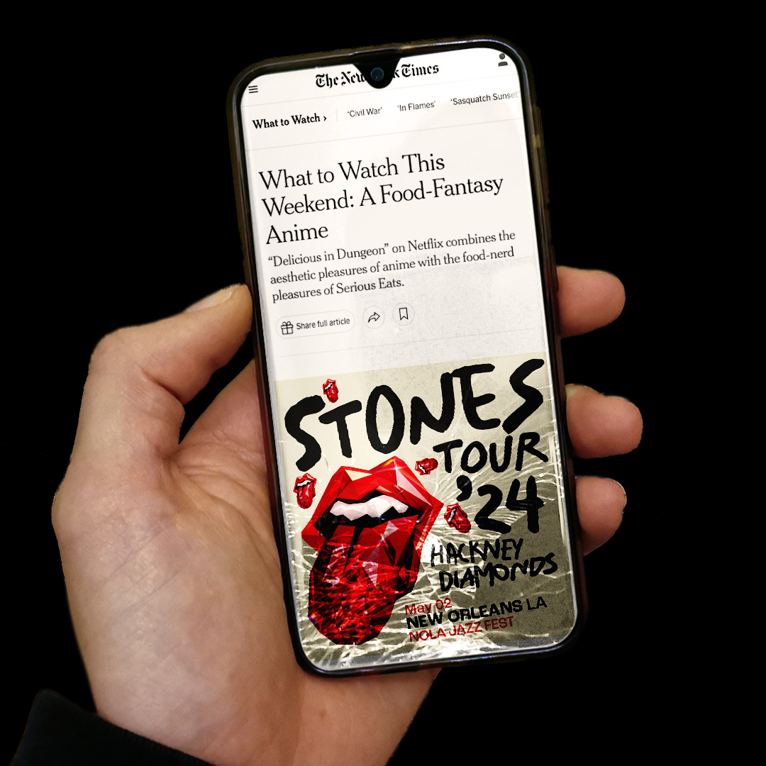
Brief: Brand the campaign for the Rolling Stones’ Hackney Diamonds tour. The brief was to connect with their new record while ensuring the tour identity stood apart.
Response: The concept taken forward was a reimagining of the iconic Tongue in a shard-like style that echoed the album title. Colours would be limited to red, straight black and a slight off-white both for punch and grittiness. I pushed a deliberately messy approach to typography, using varied sizes and orientations. This was then refined into a set of text lockups with defined scale relationships for ease of rollout. I also devised the scheme for secondary typography, covering tour dates and sponsorship lockups, and helped produce a comprehensive set of guidelines.
Response: The concept taken forward was a reimagining of the iconic Tongue in a shard-like style that echoed the album title. Colours would be limited to red, straight black and a slight off-white both for punch and grittiness. I pushed a deliberately messy approach to typography, using varied sizes and orientations. This was then refined into a set of text lockups with defined scale relationships for ease of rollout. I also devised the scheme for secondary typography, covering tour dates and sponsorship lockups, and helped produce a comprehensive set of guidelines.