Stones Tour ’24
branding
typographic design
guidelines
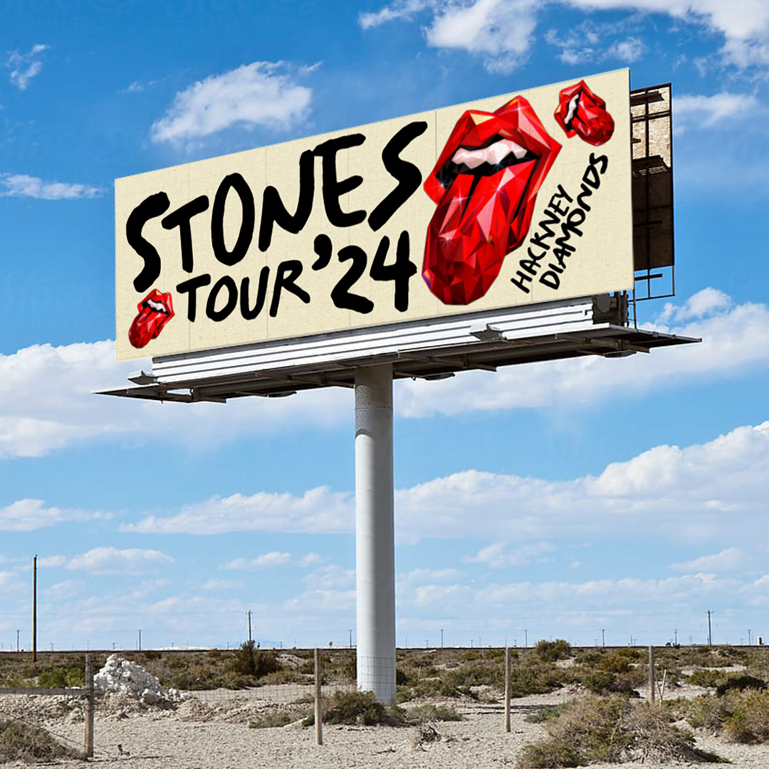
I had the privilege of working on the campaign branding for the Rolling Stones’ Hackney Diamonds tour, which was their first new album in decades. The brief was to connect with the new record while ensuring the tour identity stood apart, since the shows would not be limited to album material.
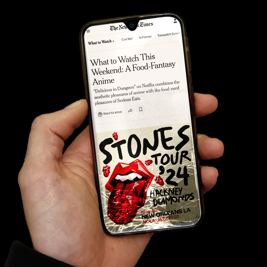
The team developed several concepts presented directly to the band. The concept taken forward was a reimagining of the iconic Tongue logo in a geometric, shard-like style that echoed the album title.
The team developed several concepts presented directly to the band. The concept taken forward was a reimagining of the iconic Tongue logo in a geometric, shard-like style that echoed the album title.

Layout and typography
My focus was developing a typographic system that would both complement this illustration and echo the themes of anger and chaos. Using the typeface Salted, I pushed a deliberately messy approach, throwing headlines down in varied sizes and orientations to capture a sense of disruption.
I also devised the scheme for secondary typography, covering tour dates and sponsorship lockups, and helped produce a comprehensive set of guidelines. These ensured promoters worldwide could implement the identity consistently across posters, merchandise, and digital materials.
I also devised the scheme for secondary typography, covering tour dates and sponsorship lockups, and helped produce a comprehensive set of guidelines. These ensured promoters worldwide could implement the identity consistently across posters, merchandise, and digital materials.