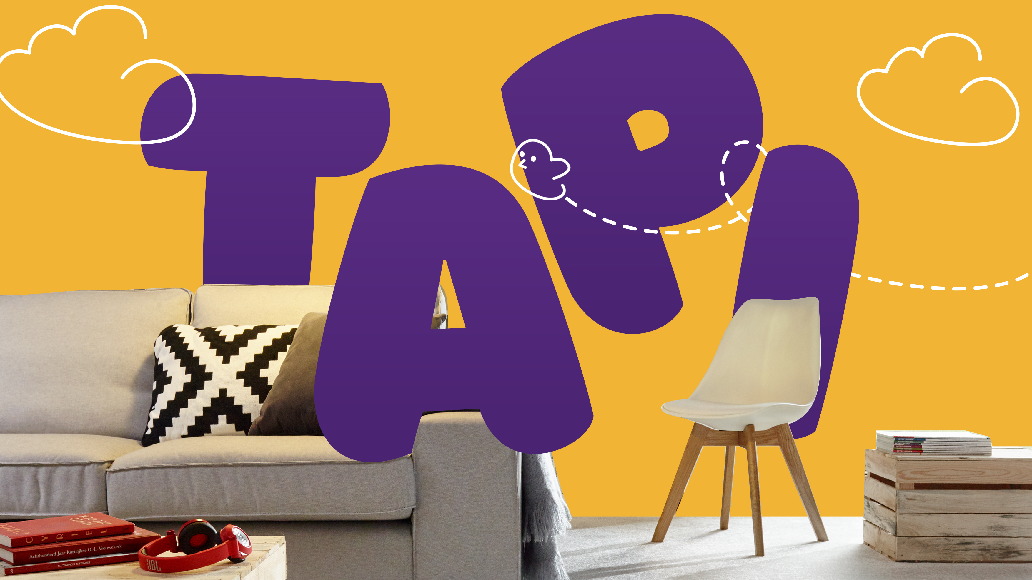
Tapi Carpets
branding, animation, social media
The client is one of the largest, and rapidly growing, carpet and floor retailers in the UK. They wanted sales branding marked them out as radically different from their competition, full of fun and personality, or ‘Tapiness’, centred on enhancing the customer experience.
Visual system
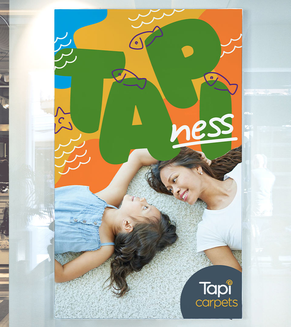
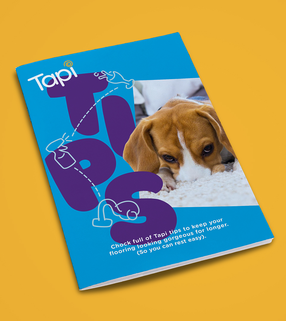
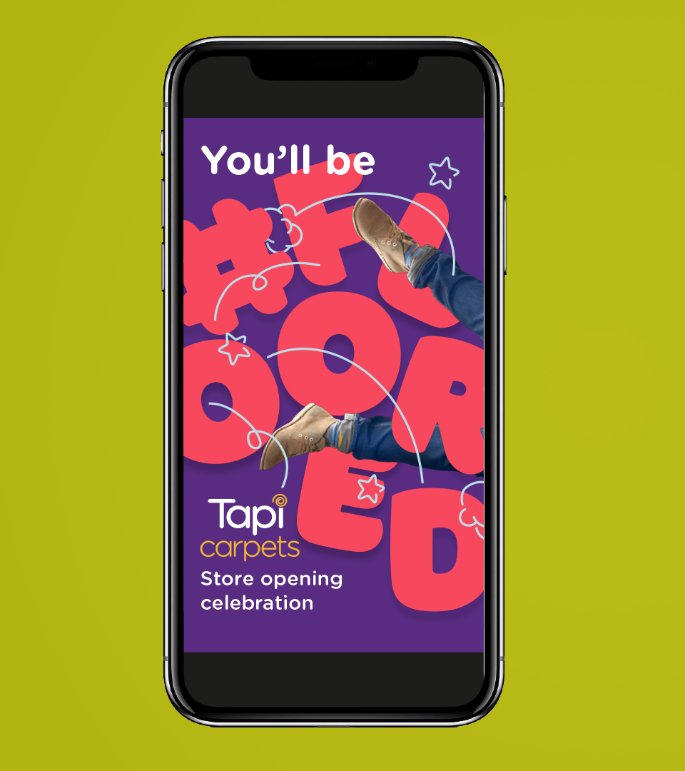
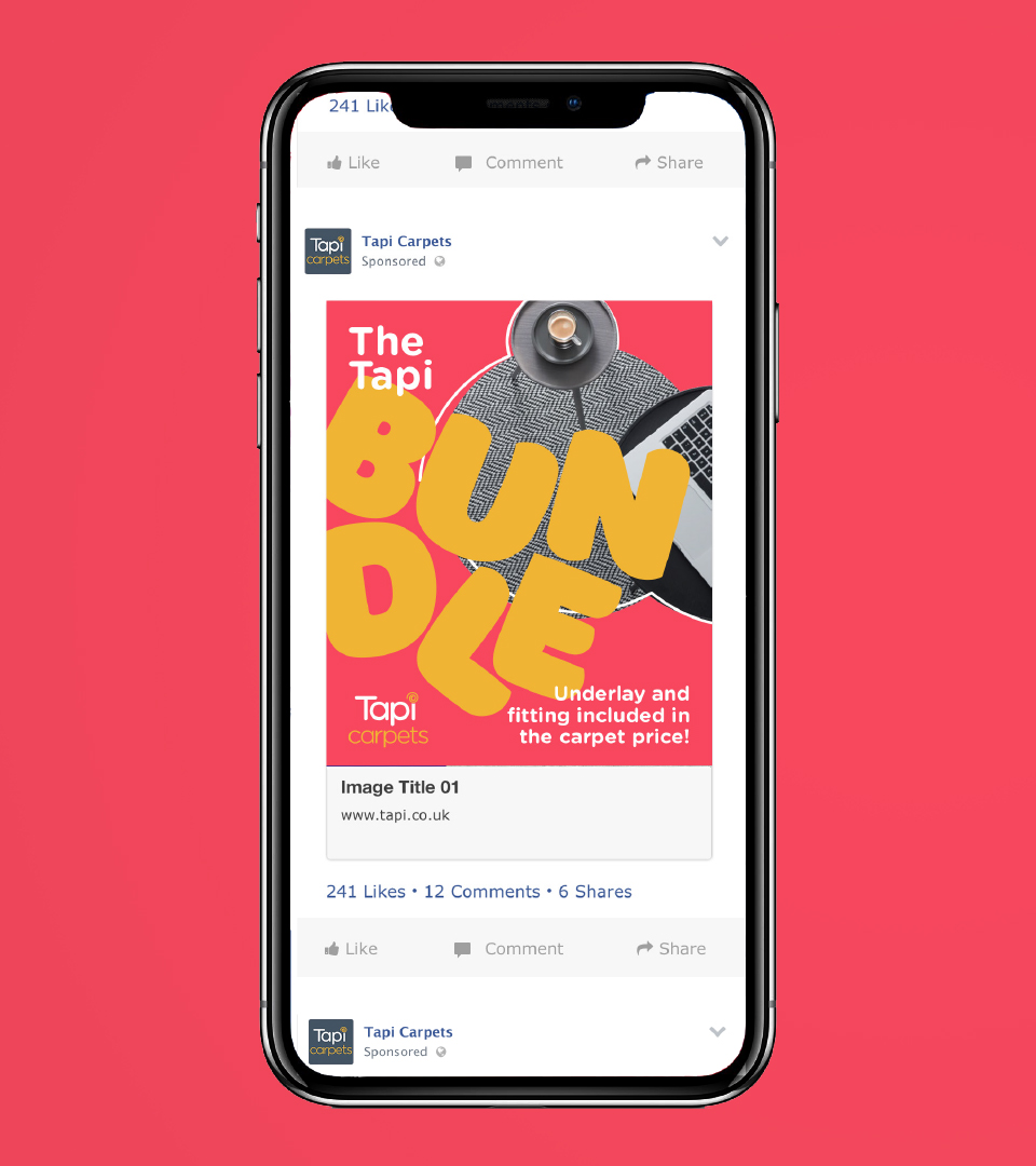
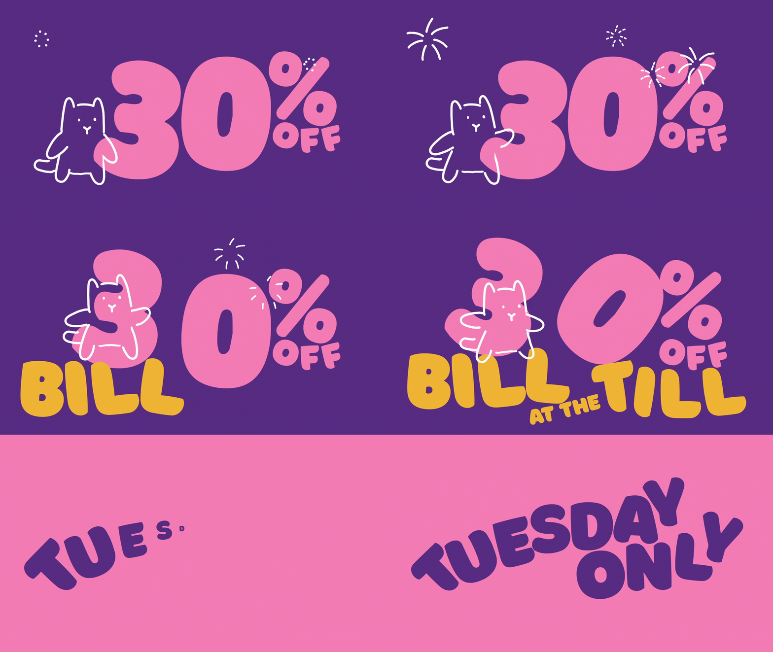
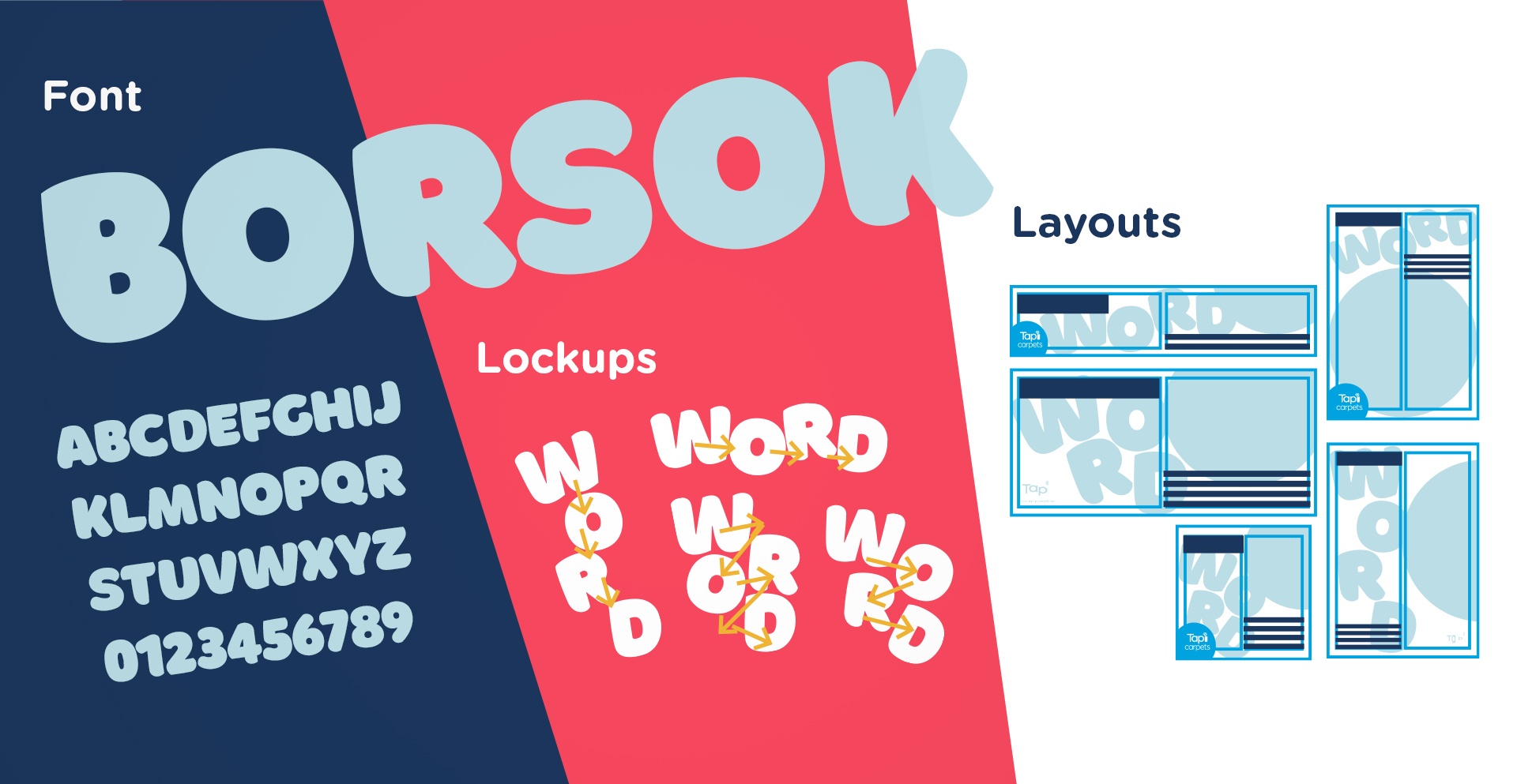
As sales and social media branding, it would need to be colourful and attention grabbing. I used the Borsok font as a starting point, and enhanced the effect of the bubble-like letters by arranging them in a bouncy, restless way, and then working out a system for consistent application. This was integrated with the already in-use font, Gotham Rounded, along with an expanded colour palette.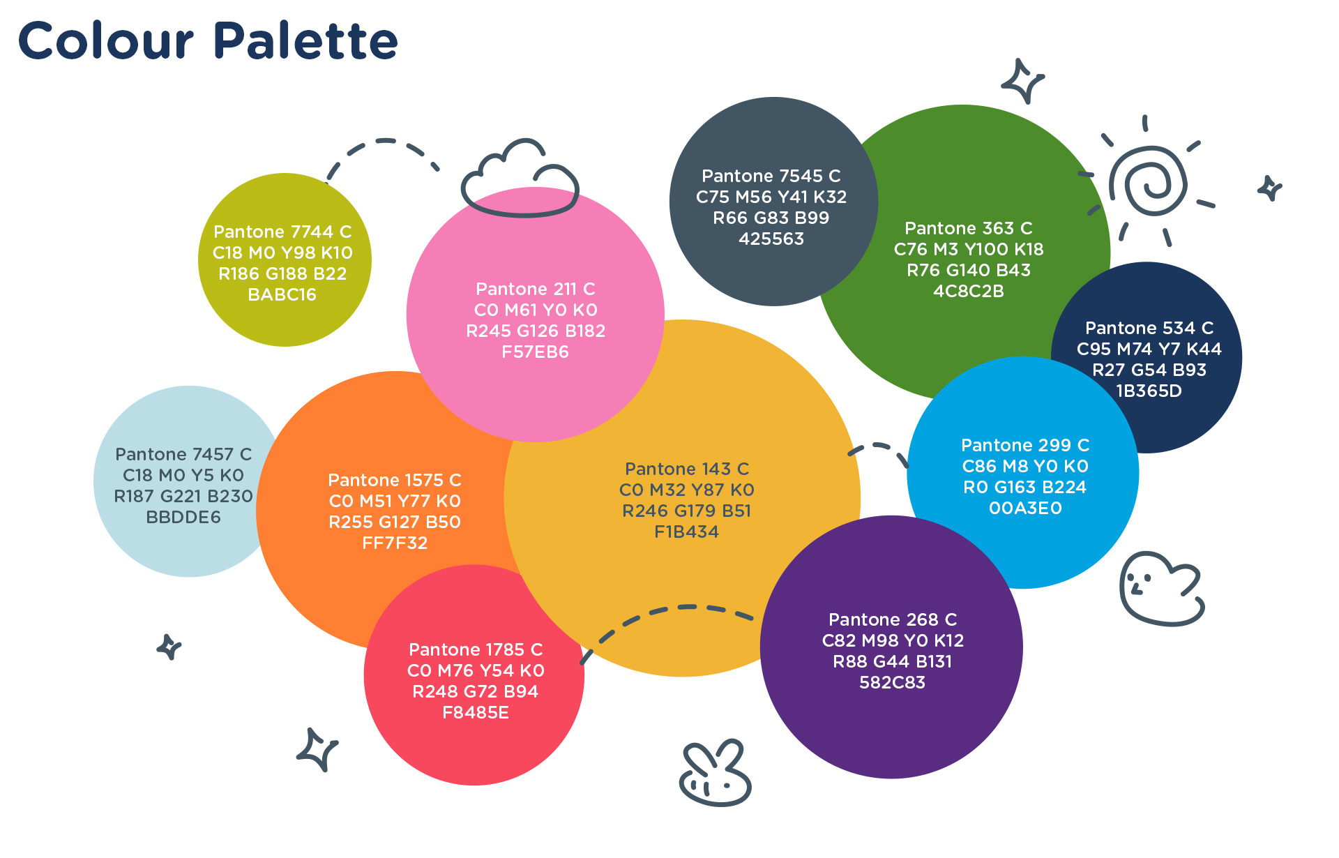
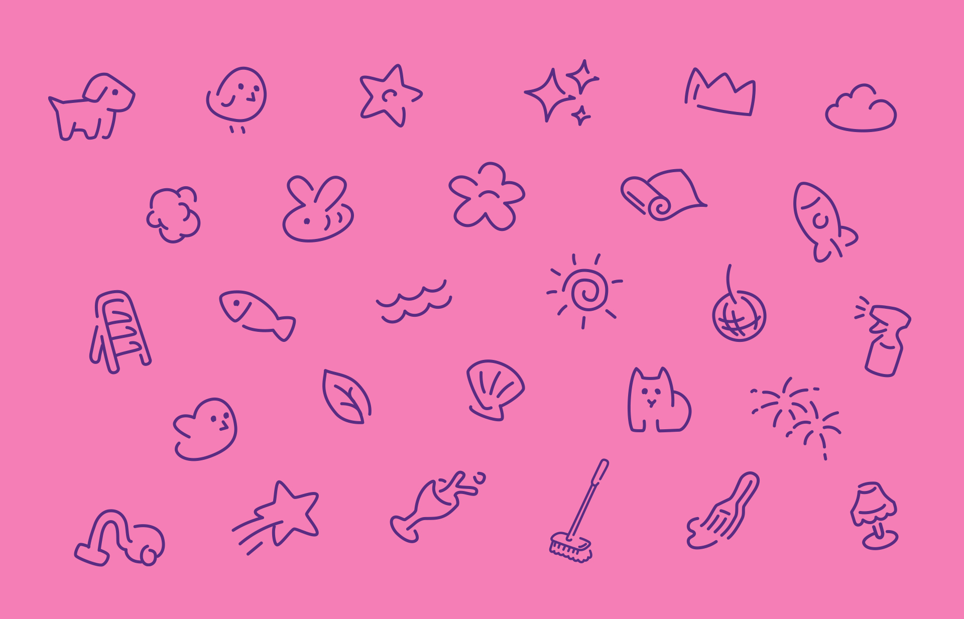
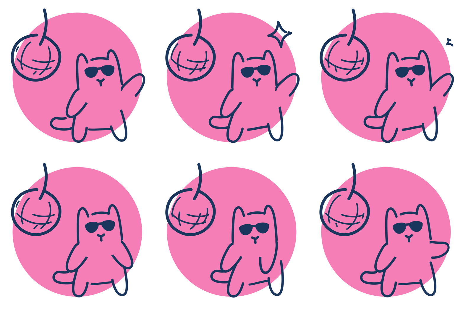
I produced an ever expanding set of icons and graphic elements that would embellish the typography and imagery. The icon illustrations were a favourite with the client, with the cat illustration becoming a staple of their advertising.
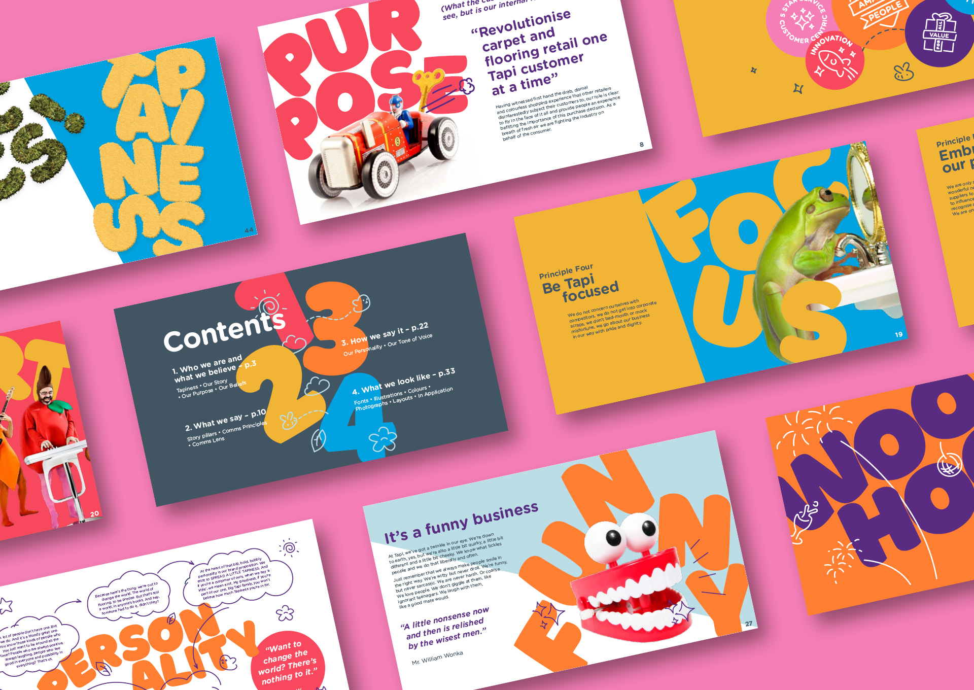
A comprehensive brand book was produced, outlining how to integrate sales visuals with the existing brand, and defining the brand philosophy and tone of voice. Crucially I made sure it not only worked as a set of brand guidelines, but also to effectively sell the brand building process to the client’s investors.
A comprehensive brand book was produced, outlining how to integrate sales visuals with the existing brand, and defining the brand philosophy and tone of voice. Crucially I made sure it not only worked as a set of brand guidelines, but also to effectively sell the brand building process to the client’s investors.
